
Click on the icons to learn more about that feature!
Snippet Drawer
Grid Element
Container Element
Text Element
Image Element
Image Gallery
Anchor Element
Link List
Video Element
Embed Element
Color Panel
Text Panel
Border Panel
Dimensions Panel
Position Panel
Alignment Panel
Show/Hide on Device
Filters Panel
Transform Panel
Preset Animations
Transitions Panel
Box Shadow
Image Controls
Video Controls
Page Structure
Interactions
Studio Mode / Content Mode
View Live Site
Brandcast Glossary
Panel Diagrams
Studio Mode
Block Library
Any collection of elements that you’ve added to the page can be saved as a reusable design snippet. From that point on, it will appear in the snippets drawer for you to use (if you save it to your personal account), or for your teammates to use (if you are a Team Edition user and you save it into your team’s account.)

1
Snippet Name Field
If you have too many snippets, you can search for them by name here.
2
Account Selector
Select which team account, or your own personal account, to see the snippets saved to that account.
3
Add New Snippet / Folder
4
Duplicate Snippet
5
Delete Snippet
6
Snippet Folder
You are able to folder your snippets.
7
Drag and Re-Order Snippet Handle
8
Snippet Options
Allows you to duplicate or delete a snippet.

1
Snippet Name Field
2
Folder Selector
Select which folder you want to save your snippet to. Defaults to first folder in the list.
3
Select Destination Account
4
Either Create Snippet or Cancel Process
Grid Element
The grid element is a foundational layout element which allows you to organize, align, and position elements within columns on the page. Grids can contain up to 12 columns, separated by gutters. The column and gutter widths are customizable. Grids are particularly useful for optimizing designs across different devices: by changing grids from a side-by-side layout to a stack at narrower screen widths, you can easily make your website responsive.
Container Element
The container element is a layout element that can contain other elements. Containers are a fundamental organizing element of web pages, allowing you to build page layouts by grouping other elements within them, or to control the behavior of multiple elements at once.
For example, if you have a group of images and text that are part of a unit (such as a preview of an article), you can place all these elements within a single container so that they are grouped and will remain together when the screen size is changed. Nesting elements within containers, and containers within other containers, is also essential to creating certain types of layering effects.
Text Element
Allows you to place text on your website.
Image Element
The Image Element is used to add an image to the page, either by directly uploading one from your computer, or by dragging-and-dropping from the Media Library. This approach is best when you want to preserve the image’s aspect ratio (its height/width ratio) at all times, rather than cropping it. It’s also important to use image elements, rather than background images, if you want to add alt-text to an image for SEO purposes. Brandcast currently supports .JPG, .PNG, .SVG, and .GIF image formats.
Image Gallery Element
You can use the Image Gallery Element to display a collection of images on your page. You can choose whether they will be organized into a grid (gallery mode), or whether they appear one-at-a-time (carousel mode.) When users click on one of the images in the gallery, it will expand to fill the screen (this is commonly referred to as a “lightbox”.) While in this lightbox view, users can navigate forwards and backwards through your gallery using arrow icons, or by swiping on their mobile device.
Anchor Element
An anchor link is a link that navigates users to a specific location on the page. Use the anchor element when you want users to be able to navigate to a destination further down the same page, or to a specific location on a different page of your site. The anchor element will not be visible to your users on the published web page; it will only be visible in the Brandcast design studio. Place the anchor element where you want the link destination to be. Then, once you’ve linked a button or other element to this anchor, users who click on that link will automatically scroll to the location of the anchor.
Link List
The link list element is a simple way to add and maintain a collection of links that can direct users to external URLs, other pages in your site, and anchor links. To create a link list, you’ll create and label the links, specify their destinations, and (if you want sub-menus) add hierarchy. You’ll then have the option of saving your link list, for later re-use. Or, you can simply connect a link list to your site map, and it will automatically generate a link for every page on your site. This will keep the link list in sync, so that any changes you make to the structure of your website are automatically applied to your navigation.
Video Element
There are two primary ways you can add video to a page: via the Video Element, or by adding the video to the background of another element. The Video Element is designed to let the user have control over the playback of the video, and is ideal for longer videos.
Embed Element
The Embed Element can be used to embed third-party widgets or custom code snippets onto your Brandcast pages. Use it to add functionality to your site such as forms, maps, ad units, or social media widgets. You can also add analytics tracking codes via embed elements. Embedded code is iframed by default, but you can opt to render your embedded code inline if you prefer. (We recommend only experienced developers do this, as it may introduce conflicts with styling or functionality elsewhere on the published page.)
Color Panel
The Color Panel allows you to define the background fill color of an element, the color of text, the color of a border/stroke, or the color of a drop shadow. Colors can be defined as a Hex code, via RGB values, or by clicking on an area of the colorspace in the panel. Any color can also be made partially transparent. The panel comes with a number of default color swatches for you to use, and you can save your own custom colors as new swatches.

1
Add Color
After you enter a hex code, you can click the add icon and save it to your color swatches.
2
Delete Color
Select any non-stock color swatch and click on the delete icon to delete.
3
Select Text Color
4
Select Background Fill Color
5
Select Border / Stroke Color
6
Select Box Shadow / Drop Shadow Color
Will not apply shadow until defined in Box Shadow Panel.
7
Your Color Swatches
8
Hex Code Field
9
Opacity
You are able to define the opacity of your selected color, from 0-100%.
10
RGB Sliders / Entry Fields
Allows you to adjust / input RGB values.
11
Color Field
12
Saturation
13
Background Blend Mode
Define the way the background image blends with its parent container, and with other background images within in.
Text Edit Panel
The text panel contains all the options for formatting the contents of a text element, including the font, text size, style, alignment, line spacing, letter spacing, indentation, and space above/below the text. You can also customize the appearance of bulleted lists.

1
Font Selector
After you enter a hex code, you can click the add icon and save it to your color swatches.
2
Add New Font
Takes you to a panel where you can add Google, Adobe, or Hoefler fonts.
3
Clear Format
Clears all inline- or element-level formatting applied to the selected text.
4
Text Size
Default is px, but can also be vw, vh, and em.
5
Line Height
Default is px, but can also be vw, vh, and em.
6
Font Weight
7
Tracking / Letter Spacing
8
Case
Choose from none, uppercase, or lowercase.
9
Text Indent
Indents first line of text.
10
Space After
Space after you hit a hard return on a line of text.
11
Space Before
Space before a line of text.
12
Cursor Options
13
Link List Options
14
Bullet Options
15
Text Align
16
Reset Dimensions
Border / Stroke Panel
Add borders to elements on the page, customize the border weight and style, and give them rounded corners. The stroke panel controls the arrangement, weight, decoration, and shape of an element’s border Applying strokes to the top or bottom of components is a good way to create a horizontal line across the page, which can be useful for visually separating content.

1
Stroke Weight
Sets the thickness of the border line, in pixels.
2
Stroke Style
Sets the style of the border line. You can create different visual effects by making the border dotted, dashed, grooved, double, ridged, inset or outset.
3
Stroke Layout
These toggles allow you to specify which sides of the element will have the stroke applied. Any combination of sides can be selected by clicking multiple buttons.
4
Corner Controls
These inputs set the roundness of the element’s corners. Larger values equate to more rounded corners. Corner roundness can be defined using a pixel value, or a percentage. If you want to ensure that all four corners of the element always have the same roundness, check the “Link All” box before entering a value. As long as this option remains checked, it will automatically adjust all the values to match every time you make a change.
Dimensions Panel
Edit the height and width, margin, and padding of elements. Adjust the gutter width and define the layout behavior of your grids.

1
Max Width
This prevents the element from becoming wider than the max-width value, regardless of how wide the browser window gets.
2
Height
3
Width
4
Hide Overflow
The overflow property specifies what happens if the content inside an element is too large to fit. Checking this box will automatically hide (clip) any content that overflows past the edge of the element.
5
Advanced Calc Options
Allows you to calculate the dimensions of an element via simple math (subtraction, addition, multiplication, and division.) You can use this to allow an element’s width and/or height to flex with the browser, while ensuring that it maintains a fixed amount of margin.
6
Padding
The amount of empty space around the within the edges of an element.
7
Margin
The amount of empty space around the outside of an element.
8
Gutter
The space between grid columns.
9
Match Browser Height
Element automatically expands its height to match the user’s browser height.
10
Full Width
Element will automatically stretch to match the width of its parent container, or width of the browser is placed directly on page.
11
Match Site Width
Element automatically expands to match the width of the website.
12
Background Full Fill
The element’s background will extend to the full width of the browser.
13
Background Box Fill
The element’s background will only extend to the full width of the website or edge of the element.
14
Stack Grid
In device modes smaller than desktop, you can stack your grid columns as a single column.
15
Split Grid
In device modes smaller than desktop, you can arrange your grid to have a 2-column split, with odd-numbered leftover columns rendering as a final, full-width element.
16
Reset Dimensions
Position Panel
The Position Panel allows you to change an element’s position relative to other elements on the page, or relative to the page itself. By default, elements have “normal” positioning, which means that they will appear one after another, and their position on the page is determined by the elements that surround them. Normal layout flow is what allows content on the web to adapt itself to any screen size and device, as it flows to fill the available space. You can use the Position Panel to change the position of an element from “normal” to “fixed.” This will take an element out of flow, and it will no longer be affected by other elements on the page around it. Instead, its position can be defined relative to its parent, or to the entire page. You can also use the Position Panel to set the z-index of an element. When elements are set to fixed positions, they may overlap and cover each other. You use this setting to define which elements are “in front” vs. “behind” by increasing or decreasing the index.

1
Positioning Grid
A visual representation of the element’s position relative to its parent. It will become available when an element’s positioning is changed to fixed. You can click and drag the blue dot to visually position the selected element. The small circles at each corner allow you to instantly align the element with the corner of its parent.
2
Positioning Setting
This dropdown lets you choose what type of positioning the selected element will use: Normal, Fix to Parent, Fix to Page, or Sticky.
3
Z-index Arrange Order
Define the stack ordering of elements, and set which one will appear “on top.”
4
Positioning Inputs
As an alternative to the positioning grid, you can use the sliders or type a value into these inputs to set the top, right, bottom, and left positioning values. This will determine a fixed element’s location relative to its parent. You can enter percentages or pixel values into these fields.
5
Advanced Calc Options
The Position Panel also has some tools for calculating the position of an absolutely-positioned element via simple math. You can use this to make an element’s position a combination of a percentage and a fixed pixel value. For example, you could position an element 20% from the left, plus an additional, fixed 20px.
6
Reset Position
Alignment Panel
The Alignment Panel allows you to set the alignment of an element relative to its parent (or to the page). This will keep the element pinned to the left side, right side, or aligned exactly in the center of its parent, regardless of the size of the device that you are viewing it on. Setting an element to left- or right-aligned will float it to that side. You can float multiple elements in a container to one side to stack them horizontally.

1
Left Align
Floats elements to the left. Top level item will be on the left hand side.
2
Center Align
Elements will be centered on the page or within their parent container, and stack on top of each other.
3
Right Align
Floats elements to the right. Top level item will be on the right hand side.
Show / Hide on Device
The Show/Hide on Device Panel allows you to hide or display content based on the screen size that visitors are using to view your site. Generally, you can make your website responsive in Brandcast by simply adjusting the styling at different Device Modes; however, there may be cases where your design requires a completely different layout on smaller devices, or you want to totally hide a specific design element (i.e. a mobile menu) on larger screens. In these cases, it may be necessary to use Show/Hide on Device to ‘swap’ different elements in and out of view.

1
Show / Hide on Mobile
2
Show / Hide on Tablet Portrait
3
Show / Hide on Tablet Landscape
4
Show / Hide on Desktop
5
Preview
This button will allow you to see all elements that have been hidden. We recommend keeping this icon selected once you begin using the panel, so elements and grids are not forgotten when a site is published.
Filters Panel
Use filters to adjust opacity, blur, brightness, contrast, and create color-shift effects on images and other elements. If you are applying a filter to an image, note that the original asset in your media library will be unaffected. The filter is only applied to the image as it appears in the context of your website, not to the source image itself.

1
Opacity
How opaque an element is. 100% is fully opaque, 0% is fully transparent.
2
Blur
Makes an element more blurry as the pixel values increase.
3
Grayscale
How much color appears in the element. This can be used to make images render black and white.
4
Sepia
Converts the element’s colors into warm shades of brown, similar to an old photo.
5
Saturate
How much color appears in the element. A higher saturation corresponds to more color and lower saturation to less.
6
Hue Rotate
“Rotates” the color around the color wheel. Use this to shift the color palette of the element.
7
Invert
Converts the colors in your element to their opposites on the color scale.
8
Brightness
Adjusts where the pixels in the element are in relation to white and black.
9
Contrast
Adjusts the difference in brightness between the light and dark areas of an element.
10
Clear All Filters
Transform Panel
The Transform Panel contains a number of sliders that let you manipulate the size, orientation, and placement of elements. Transforms can be useful for adding interesting hover states, especially when combined with easing curves that you add via the Transitions Panel. Transforms are also very helpful for creating dynamic animations in combination with the Interactions Panel.
1
Translate X
Move elements horizontally across the page.
2
Translate Y
Move elements vertically across the page.
3
Scale
Scaling is a linear transformation that enlarges or shrinks elements, by the same amount on both axes. Use this transform if you want to increase or decrease an element while maintaining its aspect ratio. A value of “1” would leave the element unchanged; a value of “2” would double its size, and so on.
4
Scale X
Scales element along its X axis (horizontally).
5
Scale Y
Scales element along its Y axis (vertically).
6
Skew X
Tilts elements left or right.
7
Skew Y
Tilts elements up or down.
8
Rotate
Rotates the element clockwise or counter-clockwise from its current position.
9
Flip X
Flips element along its X axis (horizontally).
10
Flip Y
Flips element along its Y axis (vertically).
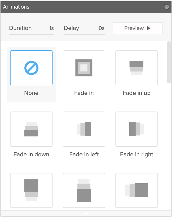
Preset Animations
Preset Animations are a way to easily add animated elements to your designs. We provide 32 different animations that can be applied and triggered when you scroll the page. The animations trigger when the midpoint of the element appears on screen, so be careful to not place them on large elements otherwise it might not trigger on smaller screens.
2
3
1
1
Duration
This value determines how long the transition will take to occur from beginning to end, expressed in seconds. All transitions are set to 1s by default.
2
Delay
This value determines how long of a delay occurs before the transition begins, expressed in second. By default, transitions do not have a delay (0s.) Delay can be useful when creating animations: if you want to create a “staggered” effect where a series of animations happen one after the other, you can give each element a slightly higher delay value.
3
Preview
Preview the interaction.
Transitions Panel
The Transitions Panel lets you control how an element’s styles transition from one state to another. By adjusting the duration and delay, you can define how much time the transition will take from beginning to end. By editing the easing curve, you can tweak the rate of change over time, and create some interesting animation effects. This feature is most commonly used when an element has a hover state, or when it is part of an interaction.
1
Ease Curve Grid
Provides a visual representation of the currently selected easing curve. It displays a repeating animation to give you a preview of how the curve will affect the rate of change. After selecting a preset curve, you can edit it further by grabbing one of the easing handles on either side, and dragging it around the graph to alter its shape.
2
Duration
This value determines how long the transition will take to occur from beginning to end, expressed in milliseconds. All transitions are set to 250ms by default.
3
Delay
This value determines how long of a delay occurs before the transition begins, expressed in milliseconds. By default, transitions do not have a delay (0ms.) Delay can be useful when creating interactions: if you want to create a “staggered” effect where a series of animations happen one after the other, you can give each element a slightly higher delay value.
4
Easing Options / Preset Easing Curves
The easing curve allows you to control the rate of a transition, from its beginning to its end. The shape of the curve can cause the transition to move faster and slower over its duration. Click one of the preset curves to apply it to the element. Trying out some of these presets is a good way to get started with manipulating transitions.
5
Reset Transitions
Resets all transition effects applied to the default state.
Box Shadow (Drop Shadow)
The Box Shadow Panel lets you apply a shadow, inset shadows, and glows, to any element on the page, and to specify its size and orientation.

1
Outset Shadow
An “outset” shadow will appear behind the selected element.
2
Inset Shadow
An “inset” shadow will appear within the element.
3
Shadow Setting Grid
The horizontal offset and vertical offset allow you to define the direction of the shadow, and the distance between the shadow and the element. Manipulating this is much like moving a virtual “light source” around the page. The easiest way to quickly change these settings is to drag the blue dot around within the panel.
4
X Offset
Moves the shadow left and right.
5
Y Offset
Moves the shadow up and down.
6
Blur Radius
Determines how far the shadow will gradually blur before it disappears. A high value for the blur radius will create a very diffuse shadow.
7
Spread Radius
Specifies how far the shadow will extend before it begins to blur out. A high value here will allow you to grow or shrink the overall size of the shadow.
8
Apply Shadow
Background Image Control Panel
You can add images to your page by adding them to the backgrounds of containers, grids, or text elements In the Background Image Panel you are able to adjust the position, cycle images for a slideshow, create a parallax effect, scale, repeat, and blend the image(s).

1
Add Image Icon
Clicking the + will allow you to upload images from your computer. You can also add images by dragging and dropping them in this space.
2
Add Image Button
Opens up your local drive folder, clicking on the folder will open your media library.
3
Remove Image
Removes the selected background image.
4
X Position
Move the background image along its X-axis.
5
Y Position
Move the background image along its Y-axis.
6
Background Image Repeat
By default, background images will not repeat within their container. You can set a background image to repeat horizontally (repeat-x), vertically (repeat-y), or both (repeat.)
7
Background Image Scale
You can set an image to cover the background area completely, contain it to fit inside the content area, or apply a specific pixel / percentage height to the image.
8
Reset Image
9
Fixed Background
Creates a parallax like effect.
10
Cycle Images
Move the background image along its Y-axis.
11
Cycle Images
If you have added multiple background images to an element, you can check this box to make them cycle automatically. This will create a “carousel”-like effect.
12
Background Blend Mode
Define the way the background image blends with its parent container, and with other background images within in.
Image Control Panel
You can add images to your page by adding them an image element. This allows for the image to always retain its aspect ratio and show the full image at all time. The image control panel allows you to add alt text to your images and to replace them with a new image. Image elements can’t be edited the same was as images as backgrounds in containers, leading to a much more limited editing panel.

1
Add Image Icon
Clicking the + will allow you to upload images from your computer. You can also add images by dragging and dropping them in from your media library or from your computer.
2
Remove Image
Removes Image from the Image element.
3
Alternative Text
The written copy that appears in place of an image on a webpage if the image fails to load on a user’s screen. Entering it in here will only apply alt text to this instance of the image, whereas entering alt text in the media library applies it to all instances of the image on your site.
4
Submit
5
Background Image Controls
If you also placed an image as a background in the image element, you can open up the Background Image Controls panel to edit it.
Video Control Panel
The Video Control Panel can be used to add a background video to an element (a container, grid, or text box) and edit the settings and behavior of that video. It is also used to edit the settings of the Video Element.

1
Video Preview
Shows a preview of your video. You can also drag a new video into this space to add a new/replace an existing video.
2
Remove Video
If video is blank, this will show as an Add Video button, and if there is already a video uploaded, this will show as Edit Video. Clicking on this button will open the video uploader window. From here you can link to an external video, upload a video from your local drive, and upload a cover image.
3
Replace/Add Video
Clicking here allows you to select whether you want to replace or add a video from a URL, your media library, or your computer.
4
Video Poster Image
If you would like to set a different cover image for your video, you can place that image here from either your computer (add image) or your media library (folder icon).
5
Video Options
Loop Video: This option sets the video to automatically play in a loop.
Auto Play: This sets the video to automatically begin playing when the page
is loaded. Only works if Mute Audio is enabled.
Mute Audio: This disables the sound of the video.
Page Structure Panel
The Page Structure Panel displays all the elements currently on the page, and shows their location in the page hierarchy. Because elements can be placed within other elements, and because the relative order of elements will affect your layout, it’s extremely important to keep track of the page structure while designing your page. The Page Structure panel displays the hierarchy as a tree. Each parent can be expanded/collapsed to show/hide its children. Selecting an element in the tree will select that element on the page, allowing you to edit it. This panel is particularly useful in finding and selecting elements that are currently hidden, out-of-view, or obscured by other elements.
You can rename elements in the page structure panel by double clicking on them. Any name you assign an element will become its ID that you can reference.

1
Lock Elements
Lock elements on your page so editors in Content Mode aren't able to change them. Locking parent items will lock child elements by default, but you are able to unlock child elements.
2
Lock/Unlock All Elements
Click here to select whether you want to lock or unlock all elements on your page. You can be more selective afterwards by clicking on the lock icon to the left of the element names.
3
Top Level Element
4
Top Level Parent Element
5
Child Element
6
Child Element That's Also a Parent Element
Interaction Panel
The Interactions Panel is used to create, edit, and delete interactions on your website. It allows you to build custom animations and events when page elements are clicked, hovered over, or scroll into view.

1
Add New Interaction
After selecting an element to be the “trigger” for the interaction, you can click the “+” button and you will be prompted to name
the interaction.
2
Delete
To delete a trigger from an interaction: This will delete the selected trigger, but leave the event intact. You will be able to assign a new trigger to it.
To delete an interaction from the page: You’ll be asked to confirm your decision. Deleting an interaction will remove the event and all the associated triggers from the page.
3
Interaction
This is your interaction and contains all the triggers associated with it.
4
Preview
Preview your interaction.
5
Trigger
6
Trigger Type
A trigger can be set to fire when the user clicks on the element, when they hover over it with the mouse, or when the element scrolls in view.
7
Trigger Effect
A trigger can cause its event to turn on, turn off, or toggle on/off.
8
Add Trigger
Any interaction can have multiple triggers. For example, you may want one trigger to turn on the event, then a different trigger to turn it off. To add additional triggers to an interaction, first select the interaction in the Interactions Panel. Then select an element on the stage, and click “Add Trigger”.
9
Reset Interaction
Global Styles
Global styles allow you to control the default styling appearance and behavior of each type of element on your website (paragraph text, images, links, etc.). Global styles can be defined on a per-device basis (desktop, tablet landscape, tablet portrait, smart phone) by changing between device modes.

1
Default Mode
How your website looks styled normally.
2
Hover Mode
You can apply different styling to elements on hover. Generally used with text links, and Horizontal/Vertical List and Sub-List items.
3
Device Mode
Switch between different device modes and make changes so that your Global Styles are responsive.
4
Element List
The list of elements you are able to style in Global Styles.
5
Style Options
You are able to style any element with the full style capabilities of Brandcast.
Media Library
The media library is where all content for the website — blocks of text, images, and videos — is stored and organized. All content in the media library can be dragged and dropped into elements on the page.

1
Add New Media
To add media to the library, click the Upload Media button at the top left. You can also drag media from your computer and drop it directly into the Media Library preview area.
2
Search
Search assets by name.
3
Preview Scale
Adjust the size of the thumbnails, for a more- or less- detailed visual preview.
4
Sort
You can sort the media in the library by date modified, date added, rating, width, height, file size, or title.
5
Delete Media
You can delete media by selecting the item and pressing delete on your keyboard or by clicking on the trashcan icon.
6
My Library
View either all assets or filter by type.
7
Integrations
We offer an Unsplash integration where you are able to browse their free stock images and use them on your site by dragging and dropping them into the studio. Images you use from Unsplash get added to your media library.
8
Filters
Filter your media by extension type, used media, and unused media.
9
Media
This is where you can see thumbnails of all the media in your media library.
10
Media Preview
11
Download
Download the media asset to your computer. Opens up media in a new window for you to download.
12
Copy Link
When you add non-media files (PDFs, documents, etc.), you are able to link to them to allow your site visitors to download the documents.
13
Media Stats
Here you can see file information and add alt tags to your images.
14
Add Tag
© 2021 TIME Sites